A 2021 survey found that one in four small businesses do not have a website. In the age of online shopping, the absence of a web presence is detrimental to business success. Poor website design can be equally harmful.
Web design has come a long way in the last decade, but one thing has stayed the same: great web design is still hard to find. It can affect everything from your website's bounce rate to the probability of getting return customers. You don't need a team of experts for your business to begin reaping the benefits of quality web design. Think of the following tips as a checklist. Consider how implementing them would look on your website as you read along.
Benefits of Great Website Design
Great web design has to serve a clear purpose. It’s quite possible the main objective for your website is a marketing function, but can you spend some time getting more clear on what goals you’re going to measure? A brand awareness campaign can be very different from a lead generation program. Your website may be more of an information sharing destination, in which case your goals may not be marketing focused at all. Regardless, your first step should be defining clear goals that can be measured, that’s how you’ll know if your web design is “great” or not in the end.
Know Your Mission and User Needs
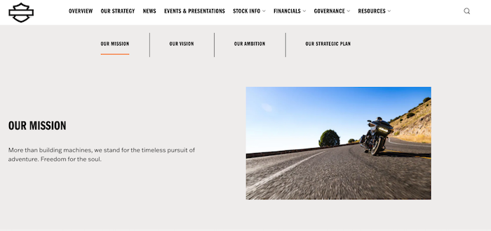
Is your company mission statement posted on your website? It should be on your about page, and it should also be a driving factor for how you make web design decisions. Consider the language and tone you want to convey, and let that guide you when it comes time to brainstorm design ideas.
Your mission statement declares what you want to achieve as a business and how you plan to achieve it. Understanding how your mission statement impacts your design decisions means understanding your approach to addressing customer pain points. As you tailor your website to your mission statement, consider how it fulfills the customer's needs.


Your brand identity is one of your most valuable assets. Make it visible throughout your site to reap benefits like:
- Higher conversion rates
- Increased visitor engagement
- Credibility
- Customer Loyalty
- Establishing brand recognition
Your brand identity is much more than logos, graphics, and colors. Voice and tone, language, photos, attitude, and storytelling. Do you want a serene, minimalist identity like Apple or a brand that represents freedom, fearlessness, and a little bit of lawlessness like Harley?
Remember that consistency is key if you want to create a brand-to-consumer connection in the minds of your users.
SEO
Search engine result pages (SERPs) are the product of the search algorithm interpreting user input. The algorithm gets its output information using web crawlers. Crawlers follow web data to map and index content.
When a search engine user inputs a query, the algorithm checks its indexes to match pages to search terms. Then, it ranks them in order of relevancy on the SERP. Some of the ranking factors deal with your website's design, like:
- Page organization
- Authority and credibility
- Readability
- Website architecture
- Mobile-friendliness
- Accessibility
Lucky for businesses, SEO ranking standards for these factors align with the tenants of quality web design.
Accessibility
Adheres to web accessibility standards to ensure a seamless experience for users with disabilities. This includes designing for users who are blind, have low vision, are deaf or hard of hearing, have motor impairments, or have cognitive limitations. By incorporating accessibility principles into navigation, and overall web design, websites become more user-friendly for a wider range of people, resulting in better overall user experience. This can lead to increased engagement and conversion rates, as well as legal compliance with accessibility laws such as the Americans with Disabilities Act (ADA) and the Web Content Accessibility Guidelines (WCAG). Additionally, accessible design benefits everyone, including those without disabilities, by making websites more intuitive and easier to use. Therefore, incorporating accessibility into web design is not only a responsible choice, but a smart business decision as well.
Photography
The emotional connection to your branding needs to influence design choices for your website. Your imagery needs to tell a story. Are you trying to show high-end luxury or a services website? Photography should have consistent branding guidelines for:
- Emotion
- Color tone
- People
- Call to actions
Purposeful Use of Videos or Animation
Engage visitors—72% of people would rather use video to learn about a product or service (HubSpot). Keep in mind the website loading speed when adding videos or animation. Too many GIFs, videos, and animations can increase website loading speeds, leading to high user bounce rates.
Most people click away from a site that takes more than 10 seconds to load double check and make sure that YouTube video isn’t increasing load time.
Simplify Your Domain Name and URLs
A quality domain is the simplest way to increase web traffic through both word-of-mouth and increase shareability. Keep your domain name simple, short, and easy to remember.
The ideal length of your domain name should be around two or three words. You should follow this rule even if your company name is longer than three words.
Take Potawatomi Hotel and Casino as an example. Putting the entire company name into the domain is confusing and easy to mess up. The company shortened its domain to paysbig.com. Staying within the three-word rule, Potawatomi Hotel and Casino website is easy to find and memorable for repeat visits. The short domain makes sharing content easier and cleaner across all forms of social media.
Impact of URLs
As discussed earlier, the photos, language, and tone used on your business social media designs should align with your brand identity. Another crucial part of web design is creating shareable links. After all, they do call them pretty URLs for a reason.
Depending on your content management system, when you create a new blog post, it receives a randomized URL tag. It will look something like this: www.mycompany.com/1&itemid=8976.
When on the telephone, on the web, in a crowded bar or at a noisy conference, you need to be able to tell someone exactly which page to go to on a website. The next time you build a website, think about making your URLs HEF.
As site owner, though, you'll likely want your URLs to display in a more elegant manner. Pretty URLs provides an easy way to remove any garbably gook to users and search engines alike while letting Concrete continue to work as usual.
Organize and customize the links to your web pages based on your site architecture and content. So, if that blog post was about new Tesla models in 2023, it would read www.mycompany.com/blog/new-tesla-models-2023.
Writing For The Web
People online are usually in a hurry and will skim or scan your writing to look for quick answers to their questions. It is important to get to the point quickly using simple, familiar words that your readers will understand.
- Avoid acronyms and jargon.
- Links should be descriptive and include keywords to help search engines.
- Organize your writing so that the most important information is first, followed by the details.
- Keep your paragraphs short.
- Two to three sentences per paragraph are best, but sometimes it's okay to sprinkle in less or more.
If you're new to designing websites, you may not know the impact of content on marketing businesses online. Content is king. Content marketing is a necessary piece of web design from your social media pages to your website blog.
Research and use tools like Google trends, Search Console, SEMRush to know what your target audience is searching for. Then, you can better cater content to your ideal customer.
Organize Your Site Architecture
One of the best ways to improve your web design is to organize your website navigation according to a simple hierarchy. Your visitors should be able to scan your website and find what they need with minimal clicking around. You should make three major changes to create the best UE possible.
First, you should create and simplify your site architecture. Think about the overarching categories you want to divide your website into. Some popular choices for businesses are:
- Home
- Services
- Blog
- About
- Contact
Next, organize all the pages under those and assign them appropriate URLs. This makes your website easy to navigate for search engine crawlers and users.
It Must Load Quickly
Whatever your goals may be, don’t slip into delivering a complicated design that takes a long time to load. These days not everyone enjoys fast unlimited bandwidth, but everyone does have a lot of things competing for their time. If your site is at all slow you will lose traffic to your competitors.
Mobile Friendly
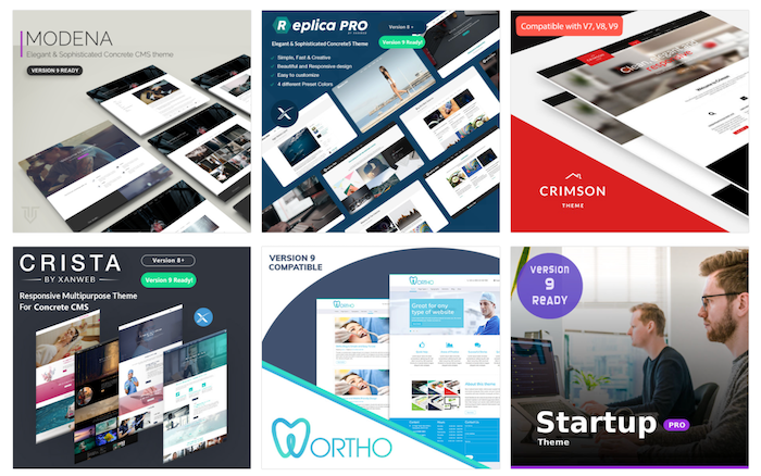
The mobile browsing experience is different from desktop browsing, yet so many companies fail to meet the needs of mobile users. Checkout the new version 9 themes that are mobile compatible.

Make Contact Information Easy to Access
Customers will not search for your contact information if it's buried within your site. You're losing potential leads. Add your contact information in a clear and conspicuous place and ensure all calls to action lead directly to this point.
Include A Style Guide with Every Newly Designed Website
On the web, a project already delivered can now be handled and further developed by new web designers and developers as a company or project progresses over time.
Creating some kind of documentation is crucial in order to maintain a consistent style and prevent parts of the work that were previously done from getting lost.
Choosing a Web Builder
- Today 33.6% of websites do not use a CMS
A content management system (CMS) is a tool businesses use to design, host, and manage their websites. You aren't starved for choices when it comes to a CMS either. Picking the right one for you comes down to finding something in your budget. Features to look for:
- Responsive layouts with templates
- Video and image support
- Navigation menus
- Editing and customization
- Fillable forms
- Blog
- Security
If you aren't hiring a professional, these features are a must. Don't sacrifice the quality of your web design by using a sub-par CMS.
Ready to Host Your Business Website?
Website design is a technical process that many professionals have mastered. But, start-ups and small businesses can't always find a place in their budget to hire a professional. That's where we can help.
Concrete CMS is an all-in-one web design and hosting platform for businesses and individuals. If you're ready to start refining your website design, we'll help you get started. Contact us today to learn more.
Sources
Why Your Brand Identity Matters More Than What You Think.
