Web accessibility guidelines enable web creators to engage users who have disabilities. These standards are essential because of the way some disabilities impact the user experience.
This is especially true for website navigation. When website navigation is broken or difficult to understand, web content becomes inaccessible. Websites must provide navigation to users who may not be able to see or interpret the navigation menu.
What is Accessible Navigation?
Accessible navigation refers to website elements that allow users with disabilities to travel from page to page. It is a guiding framework for creating web pages that enhance the user experience. These improvements aren’t limited just to people with disabilities, either. All users benefit from accessible navigation.
To explain exactly how navigation accessibility improves the user experience, we need to cover how disabilities impact that experience. Disabilities come in many shapes and forms, and every individual responds to them in a unique way.
There is no comprehensive list of conditions that qualify as disabilities, but a few broad categories that web professionals should be aware of:
- Visual disabilities include total blindness, color blindness, or poor eyesight. Someone who misplaces their reading glasses may be considered temporarily disabled.
- Auditory impairments are among the most common disabilities. Congenital deafness and age-related hearing loss are examples of auditory disabilities.
- Motor disabilities include a wide range of issues from wheelchair use, partial paralysis, or broken or missing limbs. Some of these disabilities have little-to-no effect on web accessibility (like wheelchair use). Others, particularly those that affect the hands and fingers, can have profound consequences.
- Cognitive disabilities impact users’ ability to interpret and understand information. This includes conditions like dyslexia, which makes reading fine print difficult. Neurological disorders like Alzheimer’s Disease frequently cause cognitive disabilities.
- Social disabilities include Autism Spectrum Disorder. People with social disabilities often have problems with communication. This can dramatically alter the way they use technology, often in unexpected ways.
This list is by no means comprehensive. Some disabilities – like photosensitive epilepsy – don’t fit neatly into one category. Many people have multiple disabilities, which can amplify the challenges they face when interacting with web technologies.
Also, web creators should know that many disabilities don’t involve an underlying medical condition at all. Situational disabilities rely on environmental factors that can happen to anyone. Common examples include trying to call someone in a noisy, crowded area, or using a mobile device outside with the sun glaring directly into the display.
Why is Accessible Navigation Important?
Accessible navigation is important because an estimated 15% of the global population has a disability. Disabilities are distributed across all demographics and all geographies. No matter what kind of audience your website addresses, you can safely assume that audience includes people with disabilities.
But accessibility also improves the user experience for people with situational disabilities. Making your website easier to navigate helps everyone – not just people with underlying medical conditions.
Cold weather offers an excellent example. If you live in a climate with freezing winters, try using your mobile phone outside on a snowy day. You might be able to type one or two web addresses into your mobile browser’s search bar before the cold sets in. At that point, typing coherently is near-impossible, and painful to boot.

Navigability is a critical aspect of the user experience. If your website has accessible navigation features, you should be able to move from one page to another without having to type anything at all. You should be able to use your desktop website without needing a mouse, or a graphic interface at all.
Accessibility improves website value by making navigation easier. The easier it is to move from one web page to another, the more interactions per-user your website will enjoy.
6 Ways to Provide Accessible Navigation
The World Wide Web Consortium (W3C) maintains accessibility standards through its Web Content Accessibility Guidelines (WCAG). These standards are the product of continuous work making web-based technologies easier for people with disabilities to use. The W3C provides multiple levels of compliance, ranging from the minimum necessary (A) to the optimal ideal (AAA).
While not legally binding across the board, online platforms run by federal bodies or any organization that receives federal funding must be accessible, under section 508 of the Rehabilitation Act. The Accessible Canada Act (ACA) places similar responsibilities on publicly-funded Canadian platforms.
WCAG protocols stipulate several navigation standards that web creators should incorporate into their designs. You can check whether your site adheres to these standards, you can use this free WCAG compliance checker.
Improve accessibility compliance using the following accessibility tips as your guiding framework:
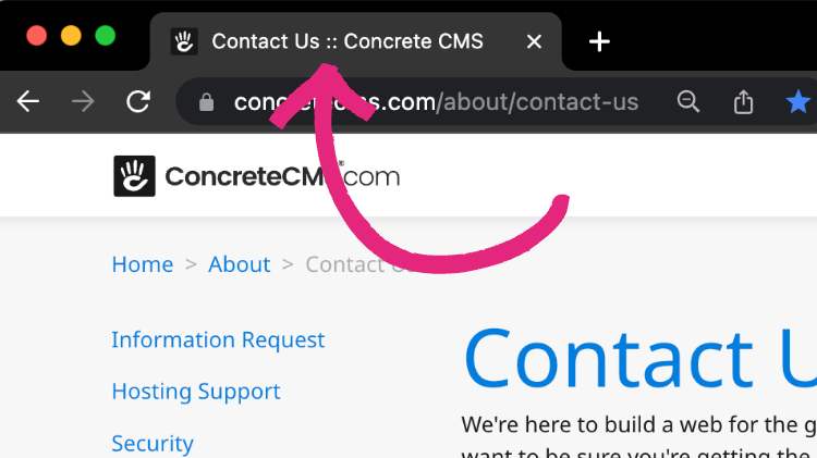
1. Provide descriptive, unique page titles
HTML page titles are of crucial importance to users with disabilities. Screen reading software like JAWS will read the page title to users first. That gives users with visual disabilities clear information about the web page without requiring them to read the entire thing first.
Writing accessible page titles is equal parts art and science. You must consider how someone might interpret the page title without having any visual context to work with. This can be challenging for web creators who tend to think visually.
For example, almost every website has a contact page. Most of the time, it is simply titled “Contact Us”. This can be confusing for a screen reader user who does not know who “us” refers to. Your contact page should include your brand or organization name directly in the page title – preferably after the word “Contact” so that screen reader users understand the purpose of the page first and foremost.

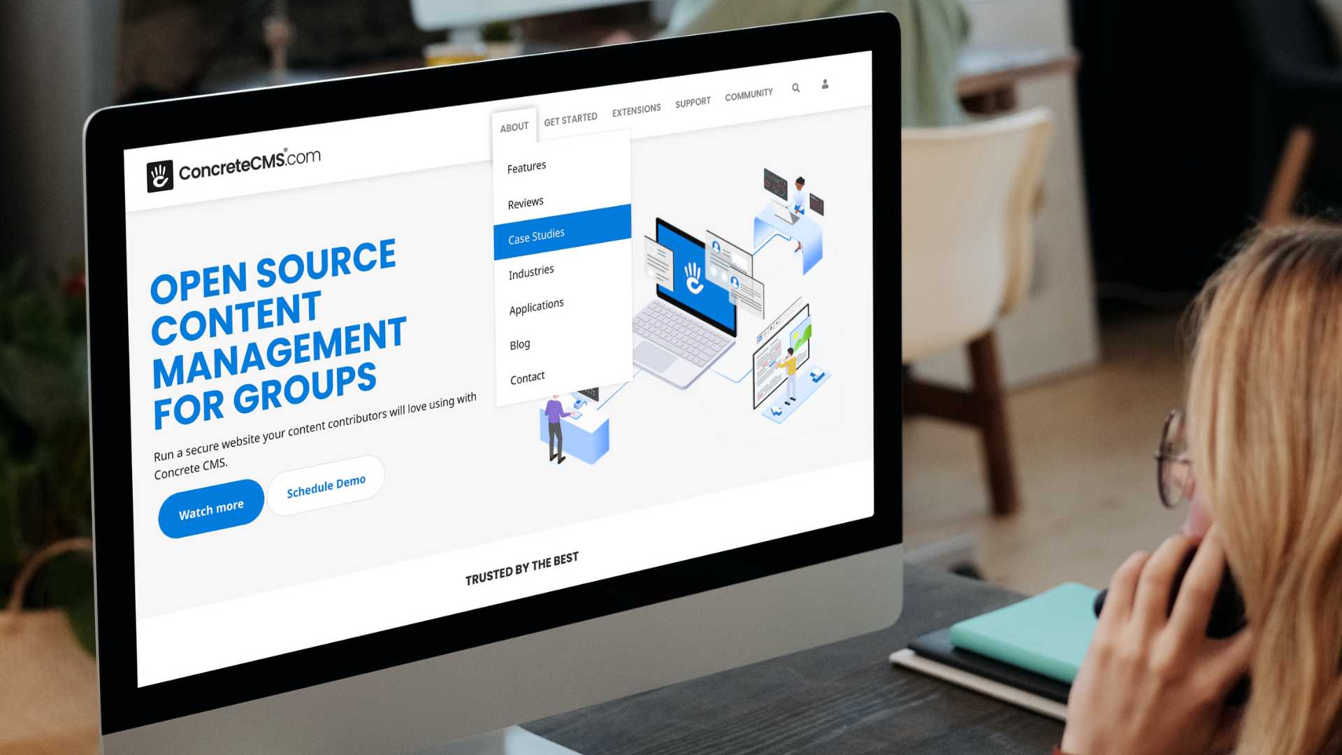
2. Create accessible and predictable menus
Menu design is a frequently overlooked aspect of website accessibility. Many designers pride themselves on elaborate custom menu animations. There’s nothing wrong with incorporating these animations as long as they don’t interfere with accessibility.
Menu structure should follow an intuitive organization pattern. This can be challenging for enterprise websites with multiple submenus. The more predictable and consistent your menu structure is, the more accessible it will be. Keep in mind that screen reader users may have to listen to each menu entry individually before making their navigation choice.
Some key things to consider when creating navigation menus:
- Navigation menus should be accessible using only a keyboard. Without keyboard access, screen reader users will be excluded.
- Mobile and touchscreen users should have large, clear targets to tap on.
- Clear and distinct menus are ideal for people with limited attention spans or short term memory difficulties.
- Fly-out submenus should not disappear immediately after the mouse leaves the clickable area!
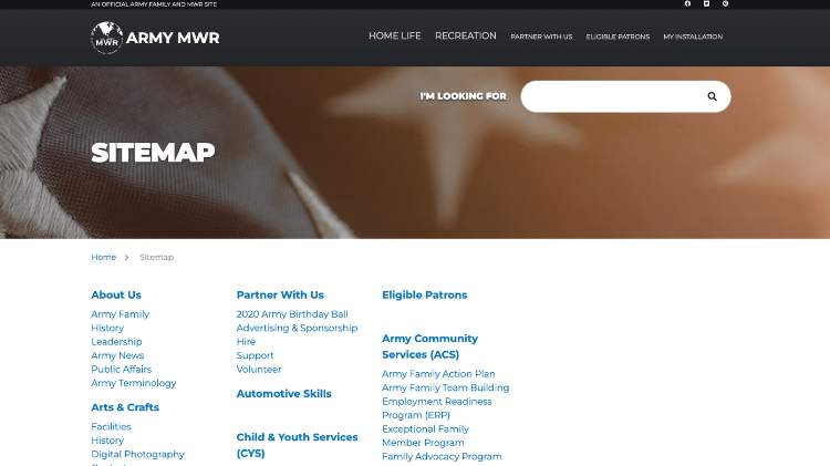
3. Make sure your site has a sitemap
Sitemaps offer a valuable alternative to complex navigation bars, particularly for screen reader users. This is especially true for large websites that change the contents of their navigation bars on different pages.
Sitemaps provide users with a simple overview of the entire website and its contents. For users with disabilities, this can be the fastest way to get from one page to another.
To meet the needs of the disability community, your sitemap must feature live links to every section of your website. These links must be valid, which means you’ll have to update them whenever you change parts of your website. Additionally, the sitemap must present all those links in a way that reflects the way your website is really organized.

4. Create consistent layouts across your site
Layout changes can be particularly difficult for users with disabilities. If one part of your website has a different layout structure than another, users may feel like they have to “re-learn” how your site works. For users with disabilities, it will feel like an entirely different website.
This is particularly true for screen reader users. Screen reading software is incredibly sensitive to the structure and layout of web content. Screen reader users often use advanced features like automatically grabbing headings and links to skim through content when browsing. This isn’t possible when individual pages have wildly different layouts.
Page layouts are also important for users with motor, cognitive, and social disabilities. The more your website structure changes, the harder it will be for these users to acclimate themselves to those changes.
5. Use meaningful anchor text for links
Links are critical to website navigation. However, most websites rely on visual context to tell users where links lead to. This context is not available to screen reader users, and may not be clear to users with other disabilities.
The standard “click here” anchor text is meaningless to a screen reader user. Taken out of context, this anchor text says nothing about where the link goes, or why a user would want to go there.
Longer, more explicit anchor text solves this problem. “Click here to learn more about our shipping policy” tells a screen reader user everything they need to know. It also provides a bigger, easier target for motor-impaired users to click on.
It’s worth noting that web accessibility can lead to significant SEO (search engine optimization) results. You can read all about that in this piece.
6. Perfect the art of headings
For users with disabilities, headings are closely related to links and page titles. That’s because they provide clear information about the content that follows. Accessibility software users can usually group headings together to skim through content, which makes it easier for them to find what they’re looking for.
But in order to do that, headings must be written in proper HTML code. A heading is more than a block of big, bold text separating two sections of smaller text. It uses a coherent, nested structure to show users how web page content is organized, and give people the opportunity to jump from one section to another using keyboard commands
Like page titles and links, great headings are informative and explicit. They tell users exactly what the content that follows is all about. Unclear headings can confuse users and push them away – and nobody wants that.
An Accessible Website is a Usable Website
Accessibility is an important part of the user experience. Although accessibility features play an important role making content available to users with disabilities, they also improve the ease of use of websites in general. Accessible websites offer fewer points of friction and less frustration. The more accessible your website is, the more usable it is.
Simply taking users with disabilities into consideration is an important first step towards improving website accessibility. Achieving WCAG compliance can be a major undertaking, but it is a valuable goal that offers meaningful rewards to web creators and their users.
